Action Button PCF

Action Button PCF
A control based on virtual FluentUI/React that allows displaying both a Standard or Primary button with an Icon next to the control. The control can also be displayed as a compound control with two lines of text (primary and secondary) and can be bound to a Two Options field so that the control is displayed as enabled or disabled.
Author: Aric Levin
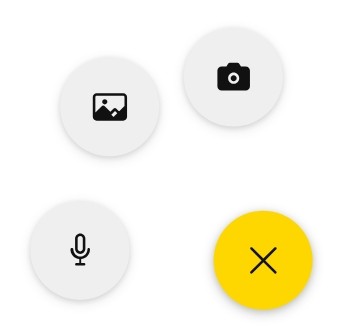
Floating Action Button
A control to show a customizable Floating Action Button for Power Apps canvas apps.
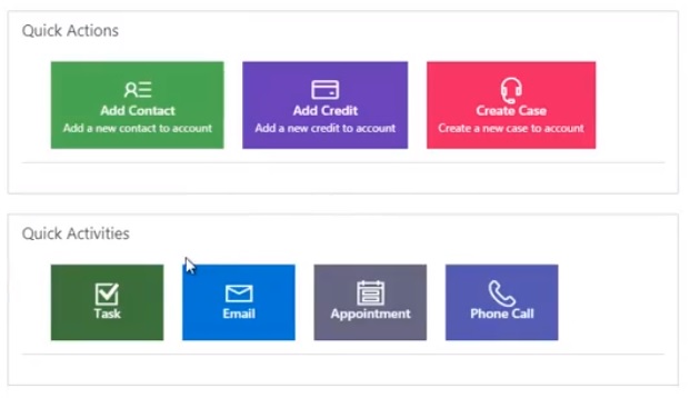
Shortcut Buttons
A control to create shortcut buttons (max 4) to open quick form or main form of other entities fr...
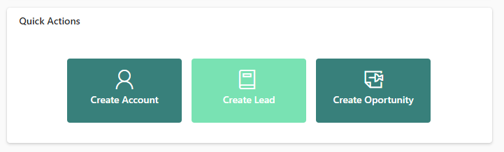
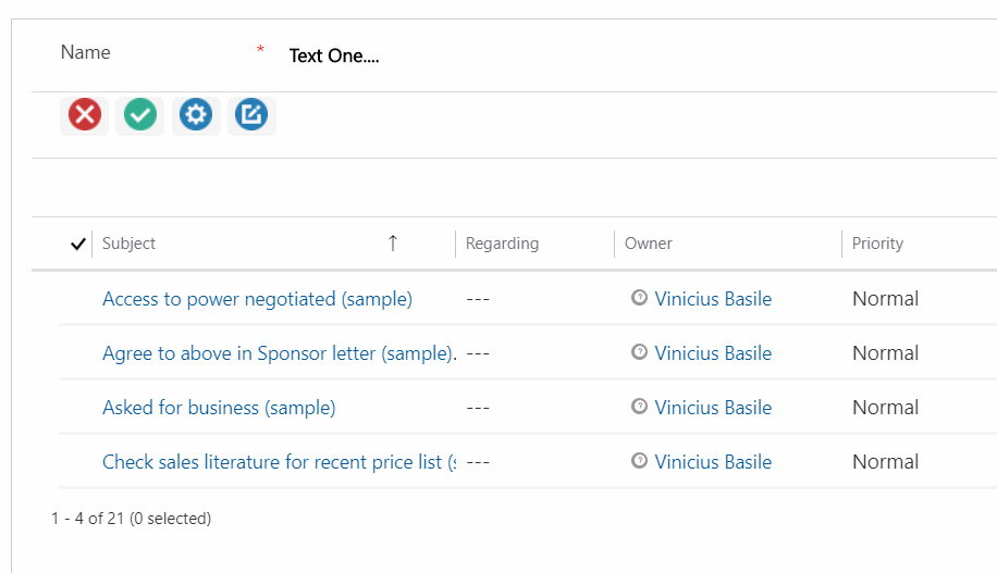
Action Buttons
A control to use actions to implement the logic and render them as buttons on subgrids.